
Context
Regular transit riders voiced many a complaint about the current way we communicate rider alerts on the website. I worked with our internal web developers to design/launch a better rider alert UI.
Problem
One of my favorite aspects of working at Metro was that the entire organization fully embraced research and data driven decisions. They routinely engaged in rider surveys, onto which I was able to piggy back and ask website usability questions.
🧪 Rider Survey Take-aways:
- Rider alerts section of the website was confusing
- Alerts were WAAAY too long and just solid walls of text.
- Riders needed key info highlighted (what stops, when, etc.)
🎯 Resulting biz goal:
Design a streamlined and easy web UI for displaying transit route changes/alerts
Solution
I explored a solution that distilled the lengthy text alert into a visual transit-line inspired ui that be easily understood at a glance.
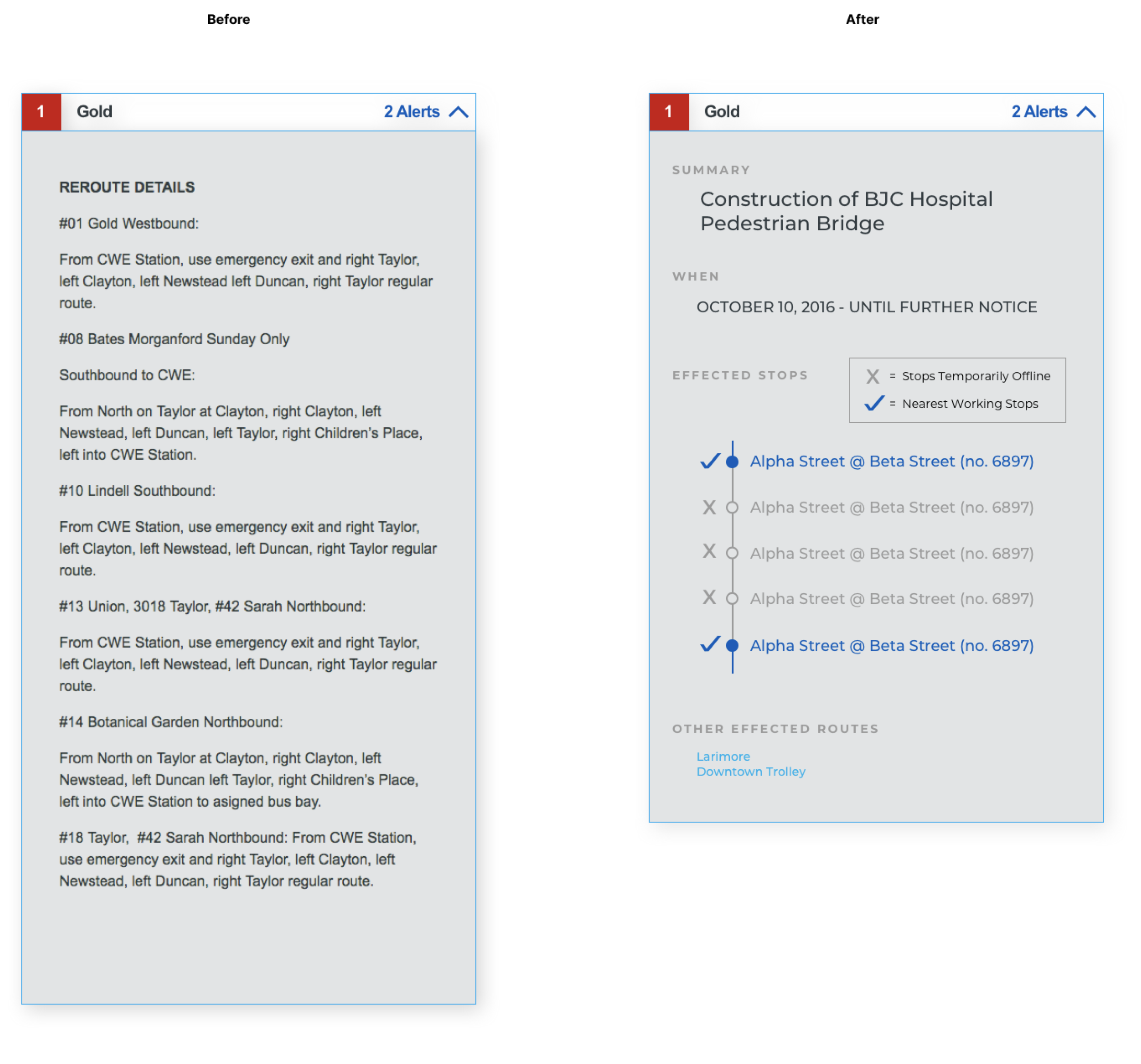
The new design clearly highlights key info including;
- reason for the disruption
- effected stops
- other routes/line that are effected by disruption
📈 Results:
Follow up rider surveys indicated that riders felt more that they understood how a service alert actually effects the effected transit route(s)